ABOUT
WORK
CV
Select by Urban Jungle | Shipped Nov 2025
Taking an existing product to a price comparison website for the first time.


Timelines
Oct - Dec 2025
Role
Lead UX/UI Designer
Team
1 Designer
1 Product Manager
8 Engineers
Skills
User research
User flows
Product Design
Usability Testing
Overview
Urban Jungle has made a name for itself by making standard insurance fair and simple. But we identified a gap: Non-Standard Home (NSH) customers. These are people with "riskier" profiles (e.g., 6+ bedrooms, previous claims, or unoccupied homes) who often get rejected by standard underwriting.
I led the product design work stream for the full launch, from initial research through to high-fidelity delivery of a new design system, the direct purchase journey, account manager and marketing flows. The goal was to make a historically complex insurance experience feel simple and human.
Discovery
Understanding who we were designing for
To get a clearer picture of who we were designing for, I built user spectrums for both standard and non-standard customers, mapping how their needs and expectations differed. Those insights fed directly into defining design principles and informed how we approached the question flow.
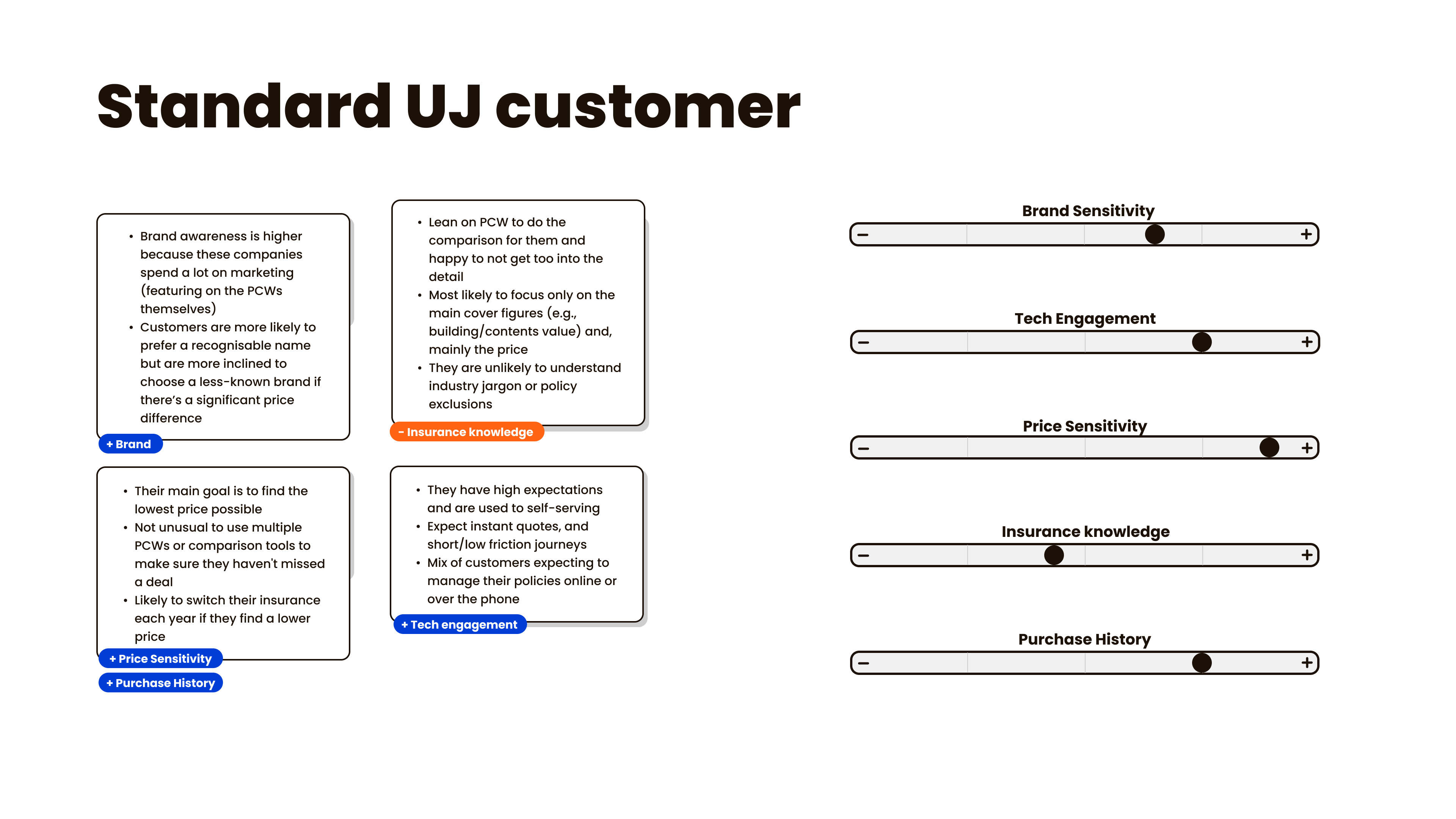
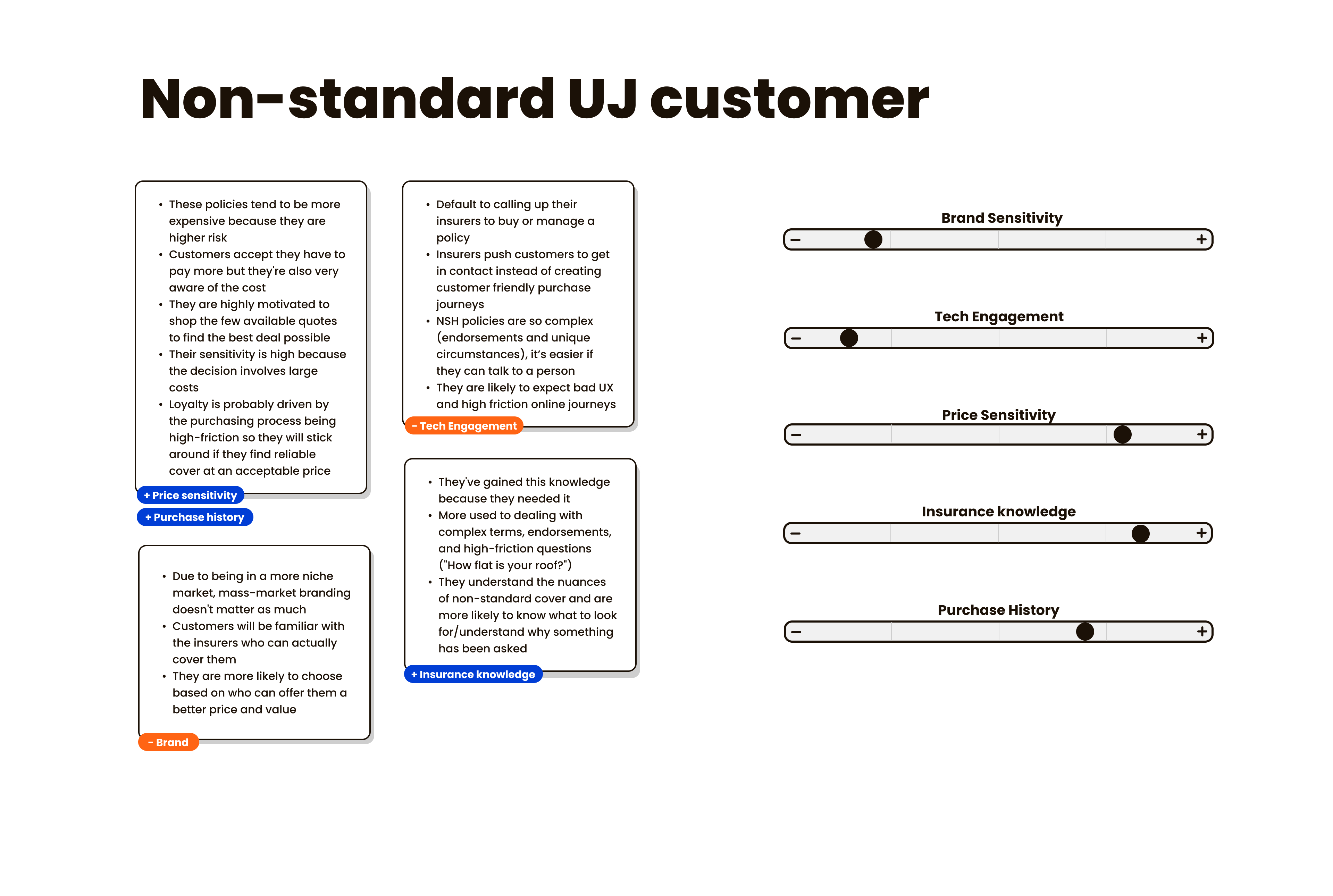
Key insights:
Standard customers want frictionless, fast and familiar whereas Non-standard customers want guided, clear and supported.
Mapping the journey before building it
We explored different user flows for different customer types. We ensured standard customers had the most streamlined journey possible, while non-standard customers were only shown questions relevant to their specific circumstances.
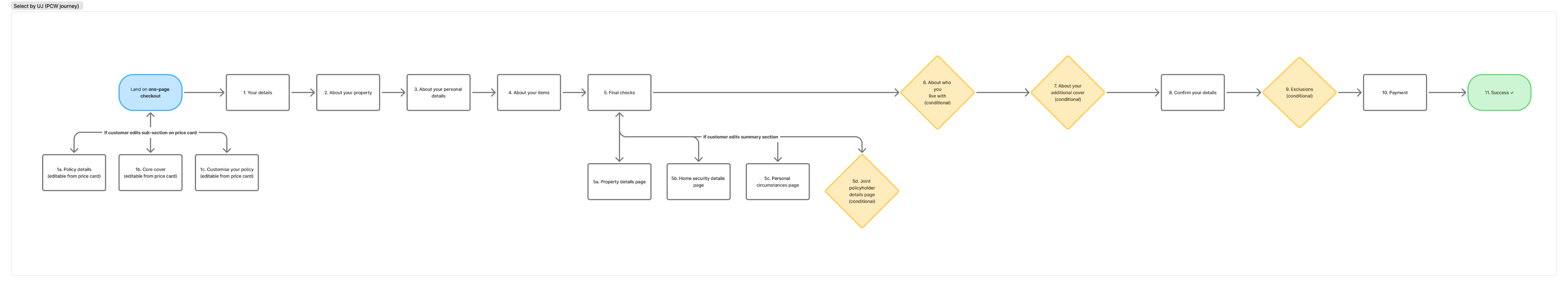
We landed on using a conditional logic approach, where sections of the flow would appear or collapse depending on a customer's answers. Iterating on this took time as we needed to map edge cases, pressure-testing the logic, and getting engineering on board but getting it right was fundamental before any visual design could begin. Once the conditional logic was finalised, we had a solid foundation for the question flow.
7 weeks
KICK-OFF TO LAUNCH
Scoping, designing, testing and delivering a full PCW purchase journey end-to-end
22%
Average month-on-month growth
Sustained across the first 9 months by progressively expanding eligibility to reach more non-standard customers
8%
CLICK TO PURCHASE RATE
From a comparison listing to completed purchase, keeping drop-off low throughout the journey
Outcome
What was delivered
A purchase journey for non-standard home insurance on MoneySuperMarket, scoped to MVP to meet a hard pre-Christmas launch deadline. The journey extended eligibility beyond Urban Jungle's standard product, reaching customers who couldn't previously get a quote. We introduced a one page checkout which included additional questions to capture information MoneySuperMarket doesn't collect, and surfaced any policy exclusions inline so customers understood their cover before purchasing.
A fast-follow release plan was agreed alongside the MVP, to close the gap between the PCW and direct journey eligibility once the freeze period lifted.
Reflection
What I learnt
Designing to a deadline changes the product
We cut scope to hit the MoneySuperMarket launch window, which meant shipping a version that fell short of the full original spec. Timelines weren’t just a project management concern, they directly shaped what we were able to build.
Channel constraints shape UX decisions
MSM doesn't collect all the data we needed to generate a quote. The extra questions at click-out weren't an edge case, they were a direct consequence of how the channel was designed. Understanding that early changed how we approached the problem.
Adapting existing patterns thoughtfully is still a design decision
We used a single-page checkout (a layout we were already exploring on other products) rather than a traditional multi-step flow. It was a deliberate call to reduce perceived effort and surface key information in subsections, not a shortcut.
Stakeholder alignment enabled speed
ringing engineers into the design process early meant we could sense-check complexity while there was still room to adjust. By the time we reached handoff, there were no surprises. That shared understanding is what made the final stages run smoothly.
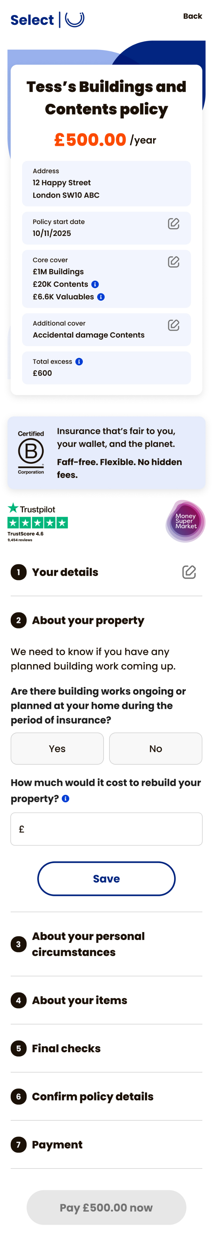
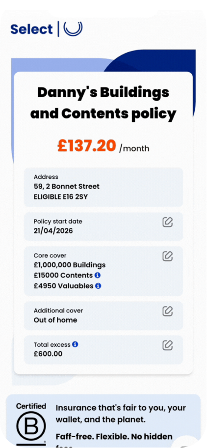
A one page checkout
To reduce perceived effort and keep customers moving, we designed a single-page checkout. Everything a customer needed to confirm sat in one place removing unnecessary navigation for the majority of users.


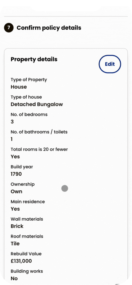
Keeping editing simple
Most customers don't need to change their details, and with complex conditional logic throughout the flow, we didn't want to clutter the main page. If a customer did need to make a change, we directed them to a specific page to do it, keeping the action contained, and out of the way of the main journey.
Design
How we made our non-standard home product work for a new channel.
Our direct journey learnings only went so far. Designing for a PCW-referred customer meant rethinking assumptions about what users already knew, what data we had, and how much we could ask of them.
Surfacing the right information upfront
Customers arrive having already given a lot of information to the PCWs. We summarised the most important details (core cover, address, add-ons) at the top of the page, so customers could immediately confirm their information had carried through correctly before purchasing.

Problem
Launching a complex product on a channel built for simplicity
Price comparison websites (PCWs) let customers compare home insurance quotes in one place. Customers have to answer a long set of questions and then are shown a results page where they can compare quotes, once they have found the price and cover they are looking for they click out to an insurers site.
Needing additional information
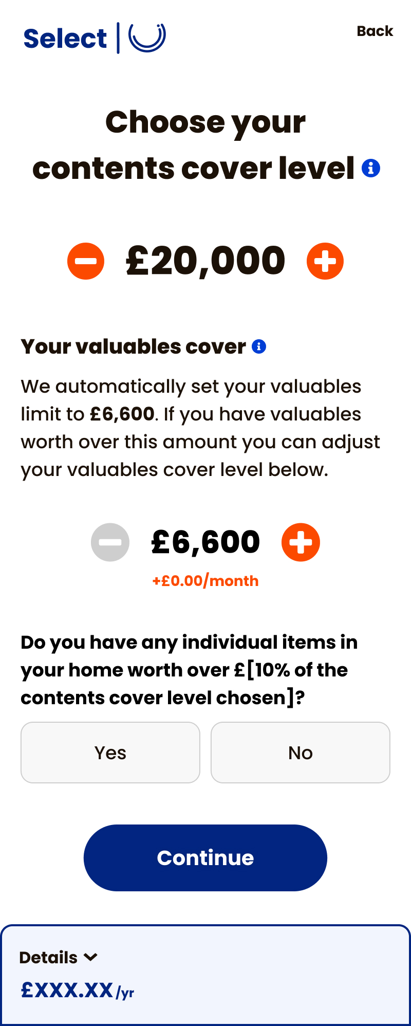
PCWs are built for speed, but non-standard insurance needs more information, adding friction at exactly the point where drop-off is most likely.
Designing for a range of users
Our users ranged from people expecting a standard insurance journey to those with genuinely complex needs so the UX had to work for both.
ABOUT
WORK
CV
Select by Urban Jungle | Shipped Nov 2025
Taking an existing product to a price comparison website for the first time.
Timelines
Oct - Dec 2025
Role
Lead UX/UI Designer
Team
1 Designer
1 Product Manager
8 Engineers
Skills
User research
User flows
Product Design
Usability Testing
Overview
Urban Jungle has made a name for itself by making standard insurance fair and simple. But we identified a gap: Non-Standard Home (NSH) customers. These are people with "riskier" profiles (e.g., 6+ bedrooms, previous claims, or unoccupied homes) who often get rejected by standard underwriting.
I led the product design work stream for the full launch, from initial research through to high-fidelity delivery of a new design system, the direct purchase journey, account manager and marketing flows. The goal was to make a historically complex insurance experience feel simple and human.
Problem
Launching a complex product on a channel built for simplicity
Price comparison websites (PCWs) let customers compare home insurance quotes in one place. Customers have to answer a long set of questions and then are shown a results page where they can compare quotes, once they have found the price and cover they are looking for they click out to an insurers site.
Needing additional information
PCWs are built for speed, but non-standard insurance needs more information, adding friction at exactly the point where drop-off is most likely.
Designing for a range of users
Our users ranged from people expecting a standard insurance journey to those with genuinely complex needs so the UX had to work for both.
Discovery
Understanding who we were designing for
To get a clearer picture of who we were designing for, I built user spectrums for both standard and non-standard customers, mapping how their needs and expectations differed. Those insights fed directly into defining design principles and informed how we approached the question flow.
Key insights:
Standard customers want frictionless, fast and familiar whereas Non-standard customers want guided, clear and supported.
Mapping the journey before building it
We explored different user flows for different customer types. We ensured standard customers had the most streamlined journey possible, while non-standard customers were only shown questions relevant to their specific circumstances.
We landed on using a conditional logic approach, where sections of the flow would appear or collapse depending on a customer's answers. Iterating on this took time as we needed to map edge cases, pressure-testing the logic, and getting engineering on board but getting it right was fundamental before any visual design could begin. Once the conditional logic was finalised, we had a solid foundation for the question flow.
Design
How we made our non-standard home product work for a new channel.
Our direct journey learnings only went so far. Designing for a PCW-referred customer meant rethinking assumptions about what users already knew, what data we had, and how much we could ask of them.
Surfacing the right information upfront
Customers arrive having already given a lot of information to the PCWs. We summarised the most important details (core cover, address, add-ons) at the top of the page, so customers could immediately confirm their information had carried through correctly before purchasing.
7 weeks
KICK-OFF TO LAUNCH
Scoping, designing, testing and delivering a full PCW purchase journey end-to-end
22%
Average month-on-month growth
Sustained across the first 9 months by progressively expanding eligibility to reach more non-standard customers
8%
CLICK TO PURCHASE RATE
From a comparison listing to completed purchase, keeping drop-off low throughout the journey
Outcome
What was delivered
A purchase journey for non-standard home insurance on MoneySuperMarket, scoped to MVP to meet a hard pre-Christmas launch deadline. The journey extended eligibility beyond Urban Jungle's standard product, reaching customers who couldn't previously get a quote. We introduced a one page checkout which included additional questions to capture information MoneySuperMarket doesn't collect, and surfaced any policy exclusions inline so customers understood their cover before purchasing.
A fast-follow release plan was agreed alongside the MVP, to close the gap between the PCW and direct journey eligibility once the freeze period lifted.
Reflection
What I learnt
Designing to a deadline changes the product
We cut scope to hit the MoneySuperMarket launch window, which meant shipping a version that fell short of the full original spec. Timelines weren’t just a project management concern, they directly shaped what we were able to build.
Channel constraints shape UX decisions
MSM doesn't collect all the data we needed to generate a quote. The extra questions at click-out weren't an edge case, they were a direct consequence of how the channel was designed. Understanding that early changed how we approached the problem.
Adapting existing patterns thoughtfully is still a design decision
We used a single-page checkout (a layout we were already exploring on other products) rather than a traditional multi-step flow. It was a deliberate call to reduce perceived effort and surface key information in subsections, not a shortcut.
Stakeholder alignment enabled speed
ringing engineers into the design process early meant we could sense-check complexity while there was still room to adjust. By the time we reached handoff, there were no surprises. That shared understanding is what made the final stages run smoothly.
A one page checkout
To reduce perceived effort and keep customers moving, we designed a single-page checkout. Everything a customer needed to confirm sat in one place removing unnecessary navigation for the majority of users.
Keeping editing simple
Most customers don't need to change their details, and with complex conditional logic throughout the flow, we didn't want to clutter the main page. If a customer did need to make a change, we directed them to a specific page to do it, keeping the action contained, and out of the way of the main journey.